HERMANMILLER.COM
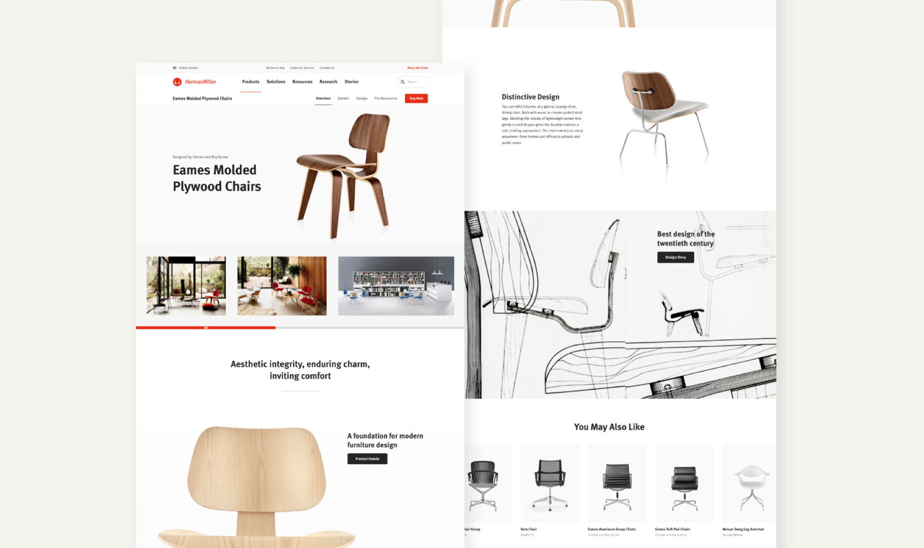
redesign the website of a century old furniture company known for its iconic designs
Overview
GOALs
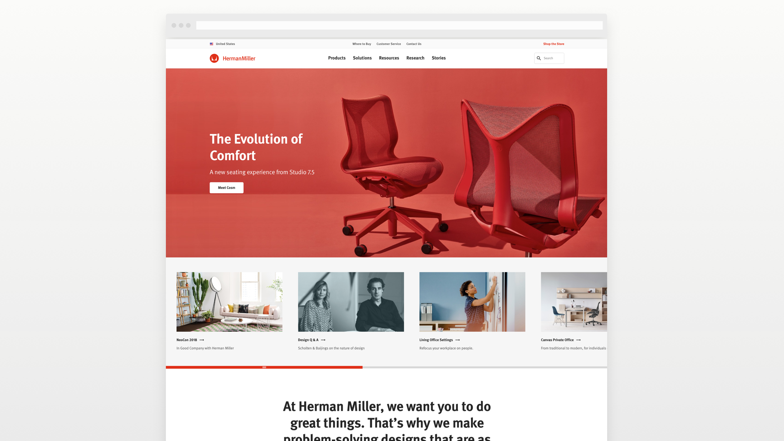
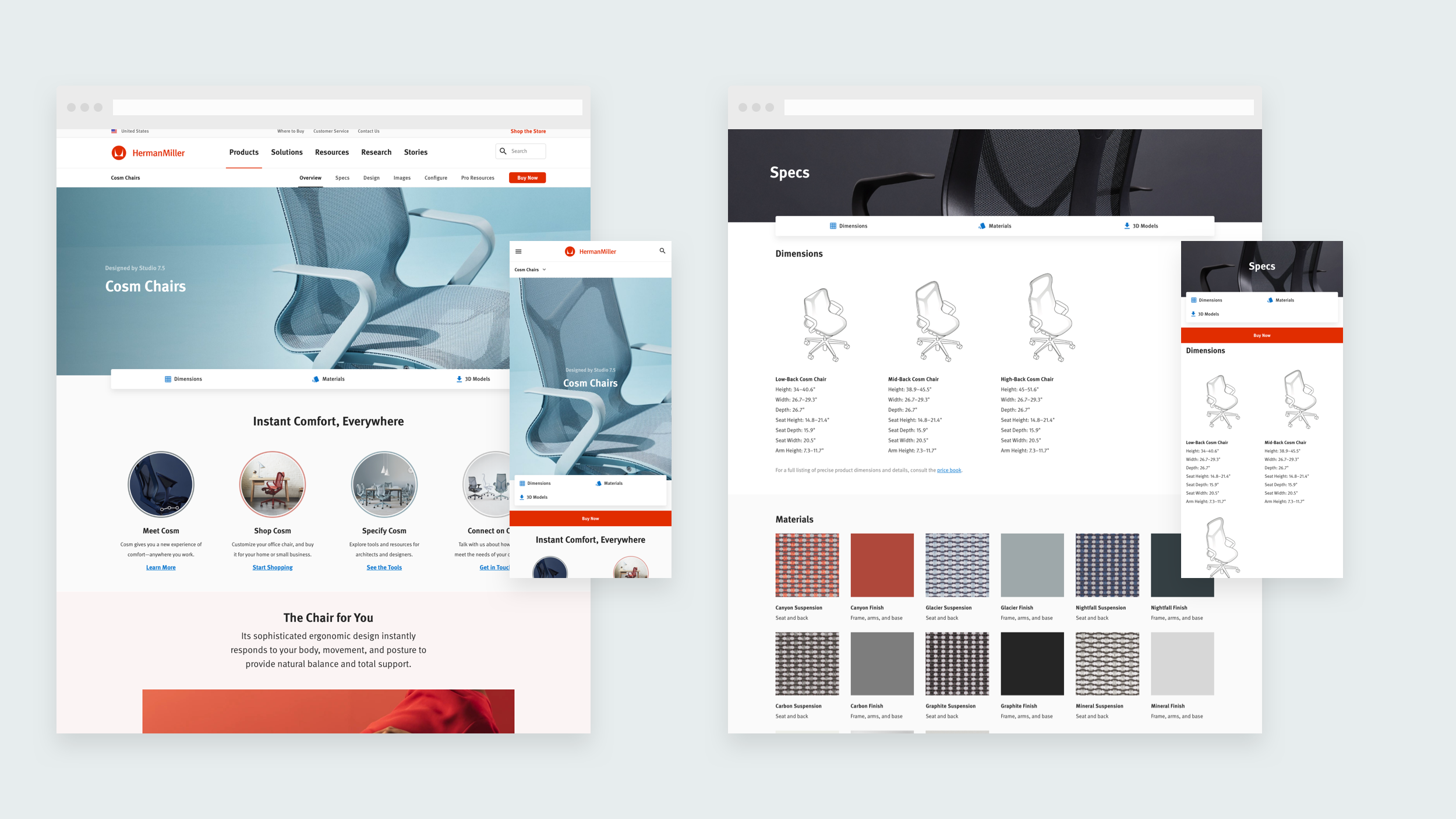
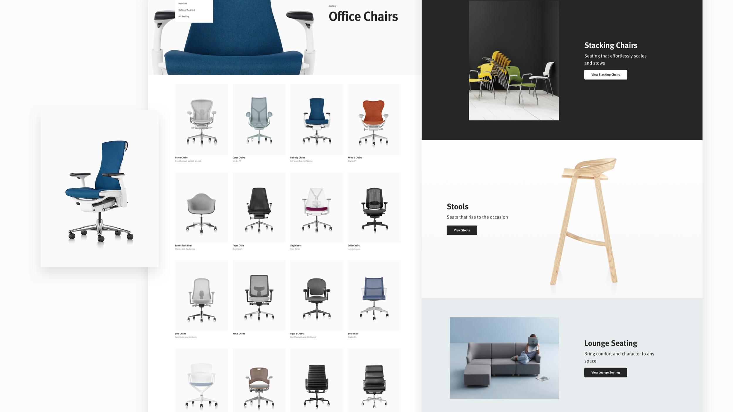
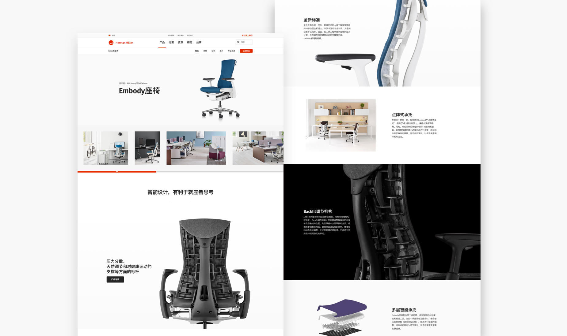
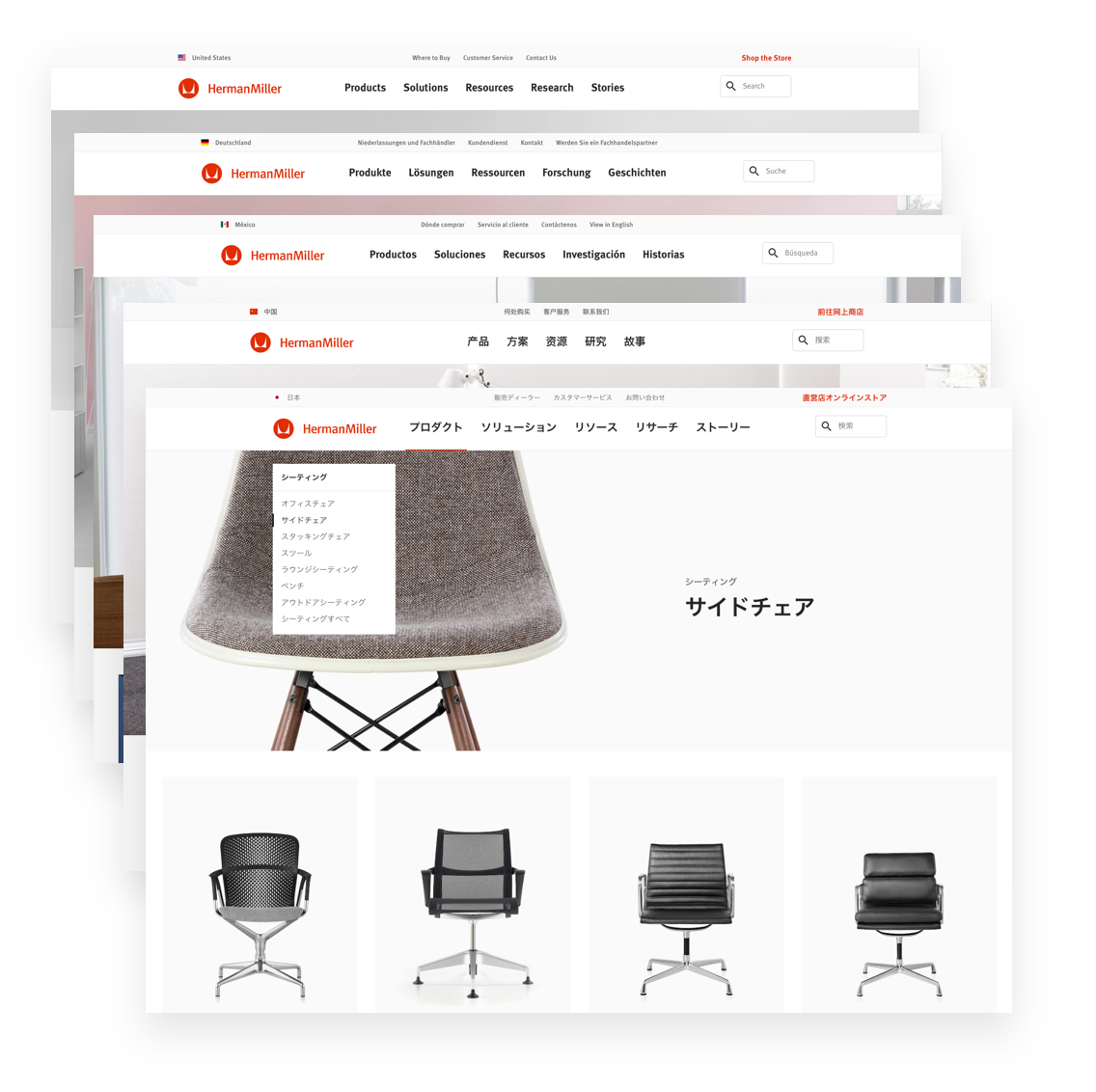
The project was to port existing content onto a mobile responsive platform. In that process we developed a design system to align digital properties company wide and took the opportunity to enhance key aspects of the site including navigation, categorization, and imagery across the site.
Creative Team
UX Lead – Laurel Stanley
Senior Manager – Eric Ishii-Eckhardt
MY ROLES:
– Product Design Lead
– SCRUM team designer
Design System
Atomic Design
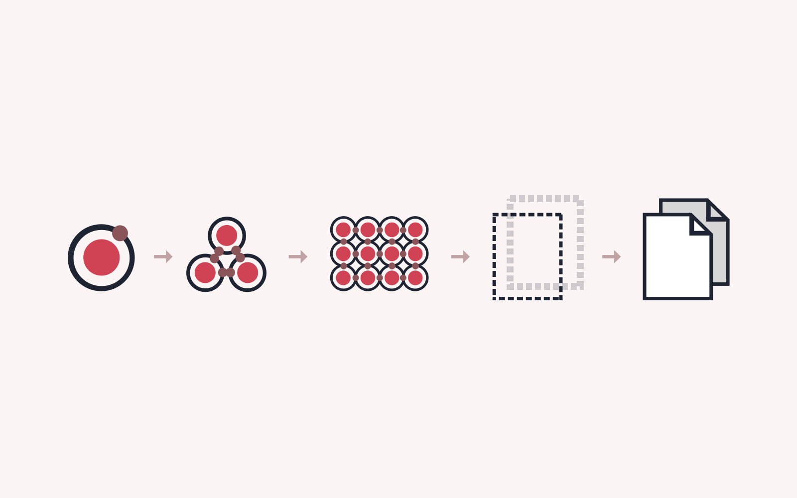
We created our design system using the Atomic Design methodology. This began with atoms like color and other design tokens to build components, templates, and final pages.
Color
We created a holistic color palette that was categorized into a Core Brand Palette, and a Spectrum for Brand Experience – these values were assigned to specific roles throughout the design system.
Responsive
Creating a mobile optimized experience was a key goal of the redesign and resulted in new systems of responsive typography, grids, and a mobile first design approach.


